I say it all the time, we have some of the best customers in the world. Talking fishing, marketing and business is never a dull conversion.
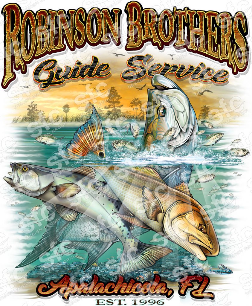
The Robinson Brothers found our graphic design style to their liking and gave us a call. The initial consultation included a wide array of ideas covering the spectrum of fishing the Apalchicola area and what it meant to them.
My desk was covered with sketches and ideas from our brainstorming session. But now it was our time to turn these ideas into a brand logo that would pop.
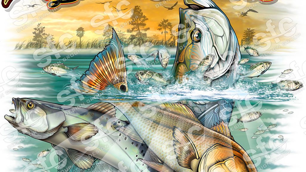
This logo was to be a 3 fish illustration including a tarpon, redfish and trout. Adding baitfish and a background scenes also made it into the plan.


