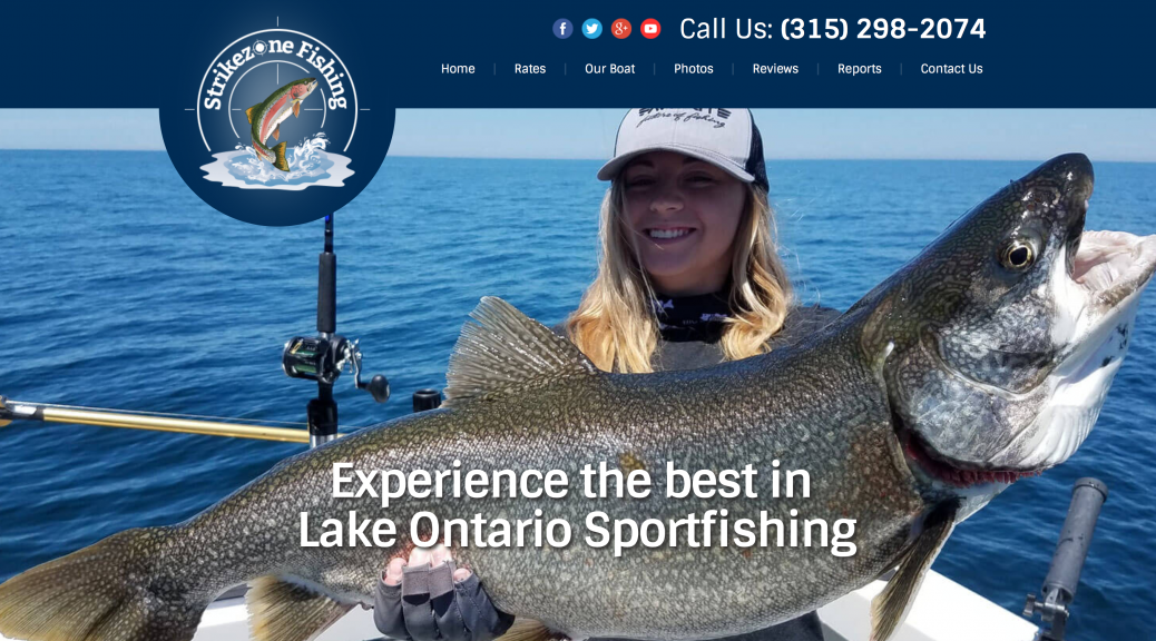
When are we going to stop throwing darts at the green?! Last week we had the opportunity to revamp our long time client’s website, Strikezone Fishing.
The Sheltra family has been with us for well over 10 years offering fishing charters on Lake Ontario. They have been a pleasure to work with and it was our turn to give back making sure they stay ahead of their competition. After all, we are all about ROI and this was an investment they could not afford not to make.

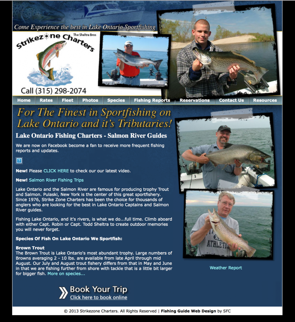
Just check out this old website design. Not bad right for over 10 years old right? Big problem, it is not mobile friend and more than 70% of their trips are booking from mobile devices.
This game is changing just about every 2 years and it was certainly time to bring their website up to date with responsiveness (mobile being priorty).
As a current client we knew exactly what they needed, so we got the team together to brainstorm the perfect home page to do one thing: book charters!
Using our formula and secret sauce we went into photoshop to start the wireframe (stage 1). Irvin, our lead designer absolutely nailed it on the first go around (which he usually does).

You’ll notice this webpage is long. This style of web design is trending and we are seeing sky rocketing conversion rates over shorter pages. This allows the content to flow as the customer scrolls down on their mobile device or desktop computer without constantly working back to the navigation menu to find what they are looking for. You’ll notice “call to actions” such as phone numbers, email forms and carefully placed “why us” sections. All crucial in the process of getting the lead.
Once presented to Todd and Robin, they gave us the go ahead to begin coding (stage 2).
Each website we code is built around the major search engines as well as every size device. Victor is the drummer of our group. He is really the most talented, but doesn’t quite get the credit. He hand codes each project from scratch rather than using a template like most firms. In fact, we won’t even touch templates. We want you to present Google with clean and unique code showing the big “G” you are all in and the authority amongst the marketplace.
As we neared completion of coding the custom WordPress theme, we planned a late night launch of the site and to work on the sub pages in the live environment. This allows us to get the client up faster, while also testing everything live, rather than staging the site.
We decided to go back to photoshop and create a custom sub page for the “rates” and “testimonials” pages. A shorter header allows for less horizontal scrolling on these pages allowing the customer to get the information they need even faster.
The finishing touch was to install a couple SEO plugins as well as sync their Facebook account with the “Fishing Reports” page.
While we ask all our clients to work the blog as much as they can, some just don’t have the time. Instead, customers like Robin are very active on Facebook, so we used a plugin to pull the RSS feed onto the reports page, keeping them fully in sync. While this isn’t the search engine juice that we prefer, it is a close second and keeps the website active and takes the burden off the site owner of updating the blog frequently.
Now that we have completed the website, we are working on Local SEO as well as Remarketing and Email marketing.
Visit the new Strikezone Fishing here and give us a call to discuss to building the perfect fishing guide website today.

