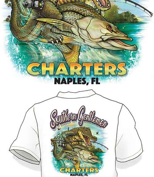
Here at SFC Design Group, it is our priority to provide extremely HIGH ROI on ALL our services. If we can’t get you Big Bang for you buck, we won’t do it. This is why we spend double and even triple the time during the logo process to ensure we WOW the world!
You see, our entire team works fluidly together. We have no weak links and we all rely on each other to produce digital marketing assets. It took me over 10 years to find this family of digital marketing experts for you.
When we got the call from Captain Tim of Naples, FL, we knew this was going to be a fun one. He really knew exactly what he wanted which is always a HUGE help. Rather than us guessing, he let us know aspects like expressions, colors, etc. He even provided us with a sketch, which I thought was pretty awesome!
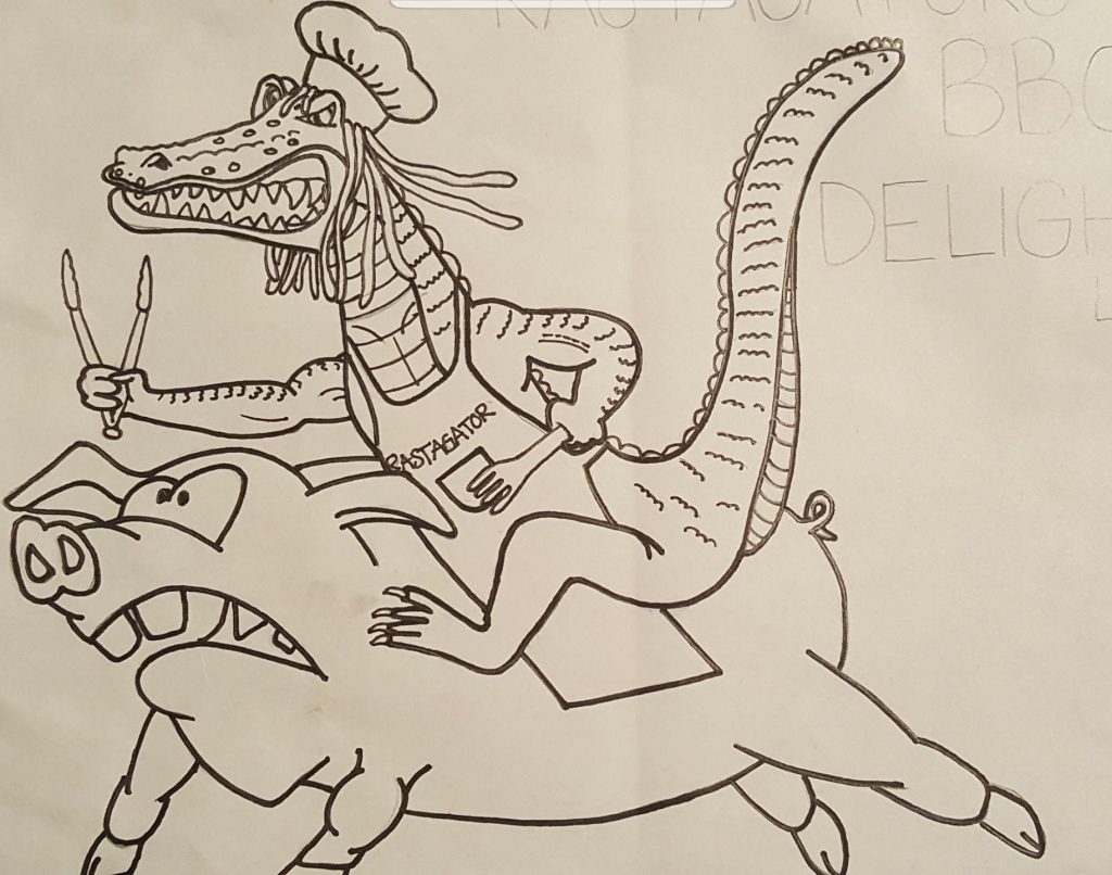
In the sketch, he showed us this unique illustration for another company he owns. However we needed to turn it into a fishing logo, so sorry little piggy but time to turn you into a snook!
And sticking with the Florida Gators, the mean gator stays, but we needed to do something a bit more original and a lot of detail. I knew Brian our illustrator would light up that gator like Tim Tebow.
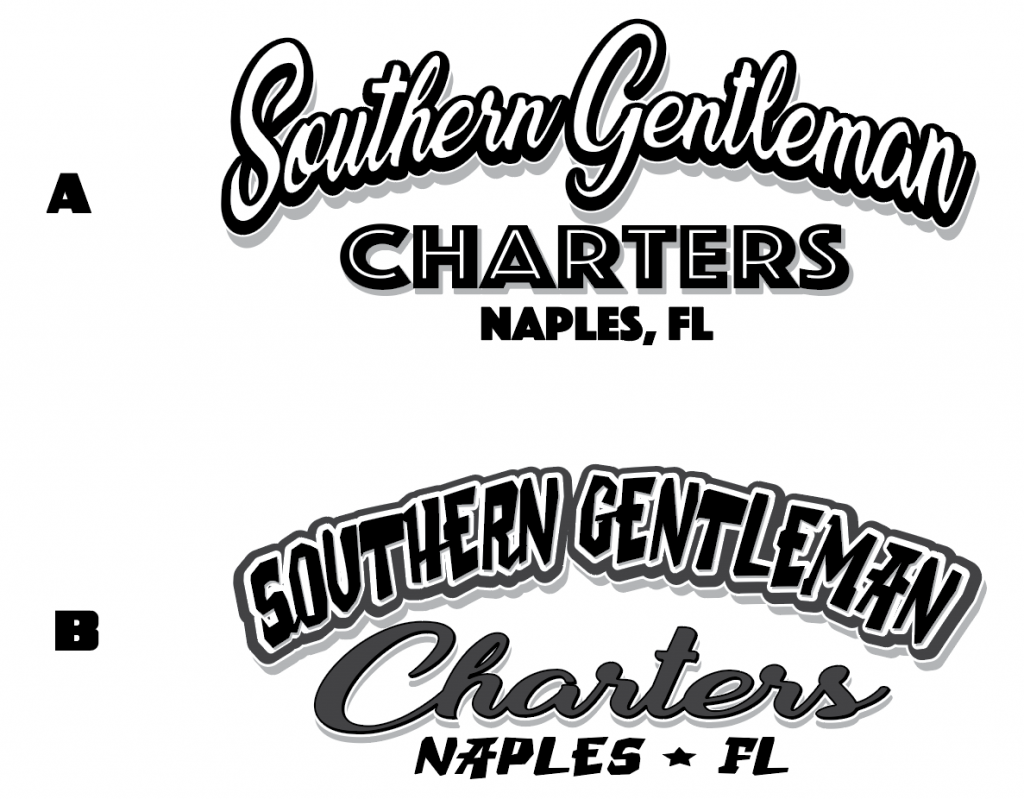
As with all logos we start with offering fonts and colors:
Upon approval, by Tim; Brian our extremely talent illustrator took to the design phase and blew us away (what else is new!)
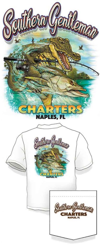
This was one of those logos that just came together perfect because the client knew exactly what he wanted and we spent over a week brainstorming. It also helped that our very own Tim is a Gators fan as well.
But this logo was not perfect to our client, YET. And it is our job to exceed expectations while tailoring to the clients request.
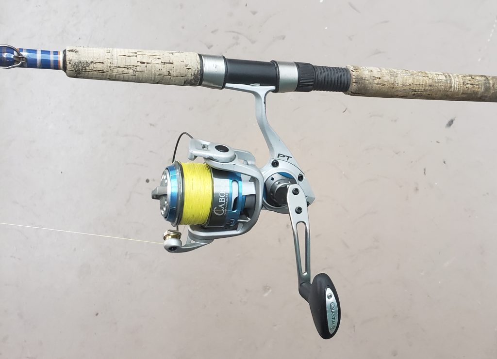
Tim mentioned that the rod and reel in the photo looks very Walmart-ish. Not his typical gear and you know what, I didn’t see it until he mentioned, and while customers are NOT always right, Tim was 100% correct and I get the feeling he will continue to make us better throughout a longterm relationship!
So I asked Tim to send us some pictures of his gear to be sure we can see what the rod butt section and reel look like. And it was obvious, this needed to be upgraded to a cork butt along with a more modern reel such as as the Cabo as seen here.
Back to illustration and out came something even better than the first round.
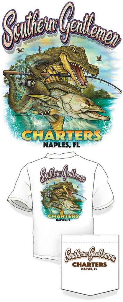
It really is the little things that make branding perfect. And with the clients vision and our team, we were able to crank out something that is surely a winner.
Logo design for the outdoors industry is our speciality, but when the clients have visions and experience, it really does go a long way. You can rely on our expertise as well, but your creativity is always welcomed and most of the time extremely valuable.
We are moving onto the rack cards, website design, t-shirts and other areas of digital marketing. Stay tuned for Captain Tim in Naples, Florida – Southern Gentlemen Fishing Charters.
Tight Lines
Captain Mike

